Guide
This visual can be used by this ways:
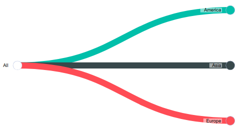
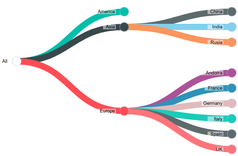
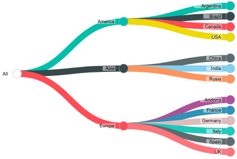
When you only select attributes for Categories field, the visual shows a simple tree. No pie charts appear in the nodes.
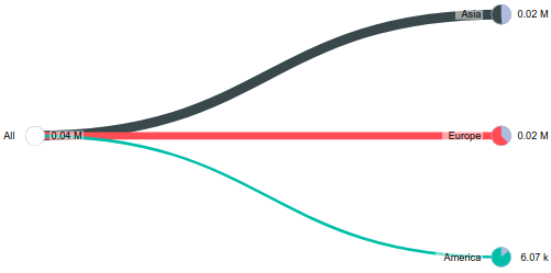
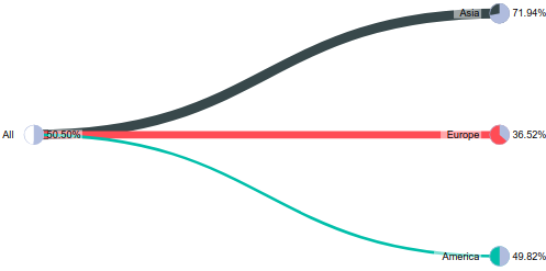
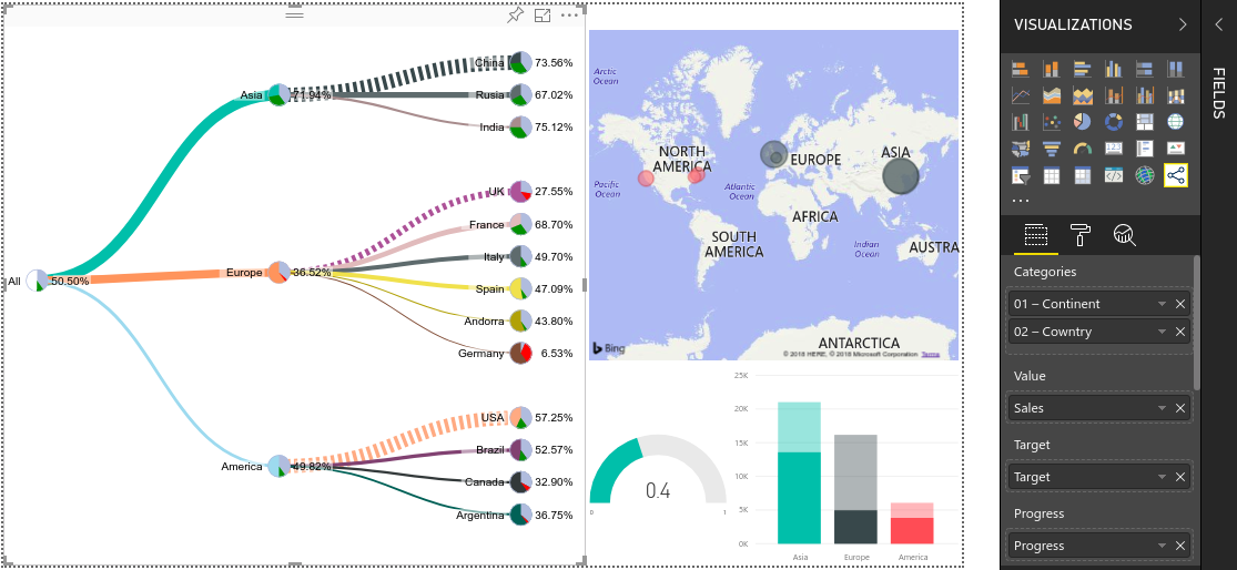
When you select one or more attributes for Categories field, and a measure into Value field. The pies of the tree shows the percent of the node value over parent value.
When you select one or more attributes for Categories field, a measure into Value field and a measure into Target field. The pies of the tree shows the percet of the node value over node target.
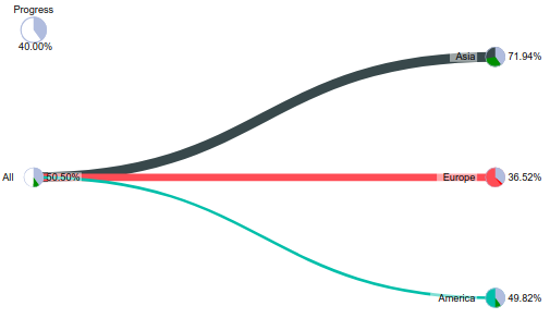
When you select one or more attributes for Categories field, a measure into Value field, a measure into Target field and a measure into Progress field. The pies of the tree shows the max value between progress and value/target. The pie will have 2 slices. The first slice goes from 0 to the min value between progress and value/target. The second slice goes from the end of the first slice to the max value between progress and value/target. The color of this last slice is dinamic depending on difference between progress and value/target.
You can interact with the visual in the following ways:
When you click on a node you collapse or expand it.
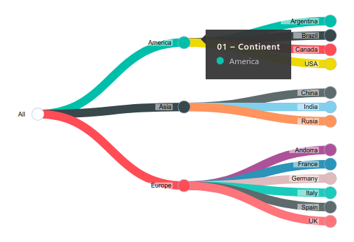
When you pass the mouse over a node it displays a tooltip.
When you click over a link you enable or dissable filters over other visuals pressent in the same page of your Power BI report
These are the fields available for the visual
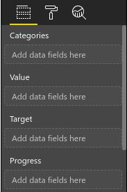
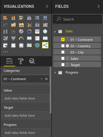
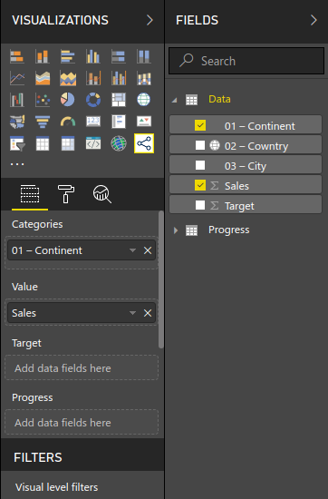
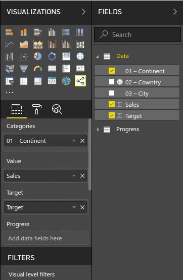
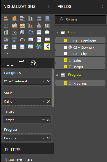
This field is mandatory. In this field you must put from one to seven attributes of your model. Each attribute you add, the tree growth one level of deep. The order of the attributes in the Categories field set the orther of the levels in the tree
This field is optional. In this field you can put one measure of your model. It will be the value of each node in the visual..
This field is optional. In this field you can put one measure of your model. It wil be the target of each node in the visual.
This field is optional. In this field you can put one measure of your model. It will be the progress of each node in the visual. It must contains a value between 0 and 1.
These are the options available for the visual
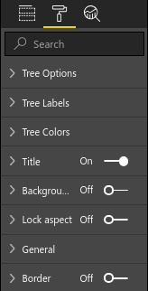
In this section you can configure general options of the visual. These are the available options:
This propertie is about the initial state of the tree. It has 4 availables options
- Expanded (default): All nodes are showed at start
- Collapsed: Only root node are showed
- Critical nodes: Only works when value, target and progress fields are informed. It shows path with all nodes with progress great than value/target
- Expand highest: It shows the leaf node with higest value
- Expand lowest: It shows the leaf node with lowest value
If it set to true, the link's size are calculated based on the node value over his parent
If no values are pressent or Weigted Links propertie are setted to true, this propertie set the size of all links
It enable or disable the tooltips when you pass the mouse over nodes. Enabled by default
This propertie is about witch nodes are collaped or expanded when you click into a node. If it is set to true, when you click in a node to expand it, all of his brother are collapsed. Disabled by default
This propertie sets the value of the radius of all nodes
This propertie set time of the animations in the tree. If it is set to 0 then there's no animations
This propertie set the left margin from the center of root node of the tree
This propertie set the right margin from the center of any leaf node of the tree
This propertie sets enable or disable the progress pie when value, target and progress are pressent
In this section you can configure options of the labes of the visual. These are the available options:
It set the name of the root node of the tree
It set the size of the labels of nodes
If it set to true hide all labels and when you pass the mouse over a link then it shows the label of the categorie of the child node. If you pass again the mouse over the link the label hides
If it set to true the values of the nodes are auto scaled
If Auto Scale Values propertie is set to false, it set the number of decimal positions of the value label of the nodes
It set the relative position of the right side of the container of the Categorie's label of each node, from the center of the node
It set the relative position of the bottom side of the container of the Categorie's label of each node, from the center of the node
It set the relative position of the right side of the container of the Value's label of each node, from the center of the node
It set the relative position of the bottom side of the container of the Value's label of each node, from the center of the node
If it set to true it add a background for the labels
In this section you can configure options of the colors of the visual. These are the available options:
It set the color of the first slice of the pie charts when values are pressent
It set the color of the second slice of the pie charts when value,target and progress are present, and value/target is great than progress
It set the color of the second slice of the pie charts when value,target and progress are present, and value/target is great than progress
If Links Color Series is set to false it set the color of links
If it set to true then sets a color for each link
If it set to true then sets a background color for each node
If Nodes Background Color Series is set to false it set the background color of nodes